Lbj Presidential Library| an app to Attract millennial visitors


ROLE
UX Designer & Researcher
TIME RANGE
Two Weeks
METHODS
User Research, Contextual Inquiry, Stakeholder Interviews, Personas, Empathy Mapping, Feature Prioritization, Sketching, Wireframing, User Testing
TOOLS
Sketch, InVision
THE BRIEF
The LBJ Presidential Library & Museum would like to increase their appeal to a millennial audience by enhancing their permanent exhibits. Though the library experienced a record number of visitors in 2015, they attribute the surge largely to a temporary and since closed Beatles exhibit. The library does not want to rely on temporary exhibits for their attendance, which is typically comprised of those older in age and school children. The library wants to capitalize on the large number of young people visiting and moving to Austin.
I worked with two partners to provide a solution that would make the LBJ Library a destination for millennials. I participated in every step of the design process and took a leadership role in conducting competitive/comparative analysis, developing personas, creating the app's content, and facilitating user testing.
*This project was completed for the General Assembly UX Design course.
RESEARCH
PROBLEM DEFINITION AND COMPARATIVE + COMPETITIVE ANALYSIS
Step 1: Define the target user - The first step of the process was to determine exactly what was meant by millennial. The term is relatively loose and there is no specific age bracket to define it. Our inquiry and research suggested that millennials were those born from 1980 to 2003. We then began to identify the technology and products used by this age group. This was informal, done mostly with sketches and lists, but the step enabled us to specify who our users were and what kind of experiences they valued.
Step 2: Identify their behaviors - Our next task was to determine if the millennial problem was specific to our client. We conducted comparative and competitive analyses to gauge what was and was not working for presidential libraries in other cities and alternative tourist attractions in Austin. We found that, with the exception of some of the world's best-known art museums, low millennial attendance was a fairly common issue.
Our early research allowed us to fully define the problem. By making sure we were solving the right problem, we gave ourselves a better chance of providing an effective solution within the short time frame.
SITE VISITS
Step 3: Contextual inquiry - Two days into the project, our research had adequately prepared us for a visit to the LBJ Library. During the visit, we spoke to visitors of all ages, library staff, and the head curator. The risk of jumping ahead to contextual inquiry without establishing the groundwork through research is an inability to ask the right questions.
Thanks to thorough research at the start, we gathered critical information during our visit to the library. And because we knew a bit about what the library was up against, we were efficient in collecting this information which saved valuable time for us and for the staff and visitors we interviewed.
Some of our most important findings:
- An elderly couple found the exhibits were easy to miss and that the map needed improving.
- A teenage visitor said she was mostly bored, but that she did like the exhibits with digital and interactive components.
- Staff members told us the guided tour is underwhelming. It is so rarely used that they no longer mention it when checking in guests.
- The head curator emphasized the shortening attention spans and over-reliance on smart phones that is common among millennial visitors.


PERSONAS
Step 4: Compile research - Based on the visitors we encountered at the library, we created personas to provide a representation of our users. We listed their goals, motivations, frustrations, brand affinities, technological aptitudes, and generated an ideal experience for each. Because these were based on field research, they offered a good summary of the users that would engage with our proposed solution. It was important for us to include personas of those outside of the millennial age bracket because we needed the personas to truly represent everyone we saw at the library. Further, we wanted to be sure we were creating a solution that would not take away from the experience for non-millennials.


FRAMEWORK
EMPATHY MAPPING
Upon returning from the visit, we unloaded all of the information we gathered straight away. We made charts, maps, and lists. We used our personas and inquiry notes to record what visitors would think, hear, and see at the library. This empathy map made our understanding of the issue and our users more and more robust.

IDEATION AND FEATURES + PRIORITIES
With a clearer picture of our issue and users, we could begin to brainstorm ideas for a solution. We knew that interaction and digital offerings were appealing. We knew that millennials used their smart phones. We thought of a virtual reality tour. We thought of gamifying the experience. We thought of happy hours. At this point in the process we didn’t rule anything out. Each idea was presented to potential users and we found that we had some really good thoughts… and some really bad ones. But we considered these productive failures. And because we got immediate feedback from our users, we were able to keep building efficiently. These failures were vital to the innovation process.
This process allowed us to hone in on an app that would enhance the experience for millennial users without diminishing the experience for other age groups that would not relate to it as well. We created features and prioritized them based on the client’s budget as well as time restraints. We established an MVP focused on the user's needs and balanced with the client’s resources.


CONCEPT & USER FLOWS
The proposed app utilizes beacon technology to allow users to consume noteworthy events of LBJ’s presidency through the medium of modern day social media. When within range of a Beacon, the user’s phone will receive a push notification in the style of social media alerts. The app will provide an exciting digital and interactive component to each exhibit without requiring heavy investment from the library. Nor will it take away from the experience of the visitors choosing not to use the app.
With the idea in place, we needed to start producing.
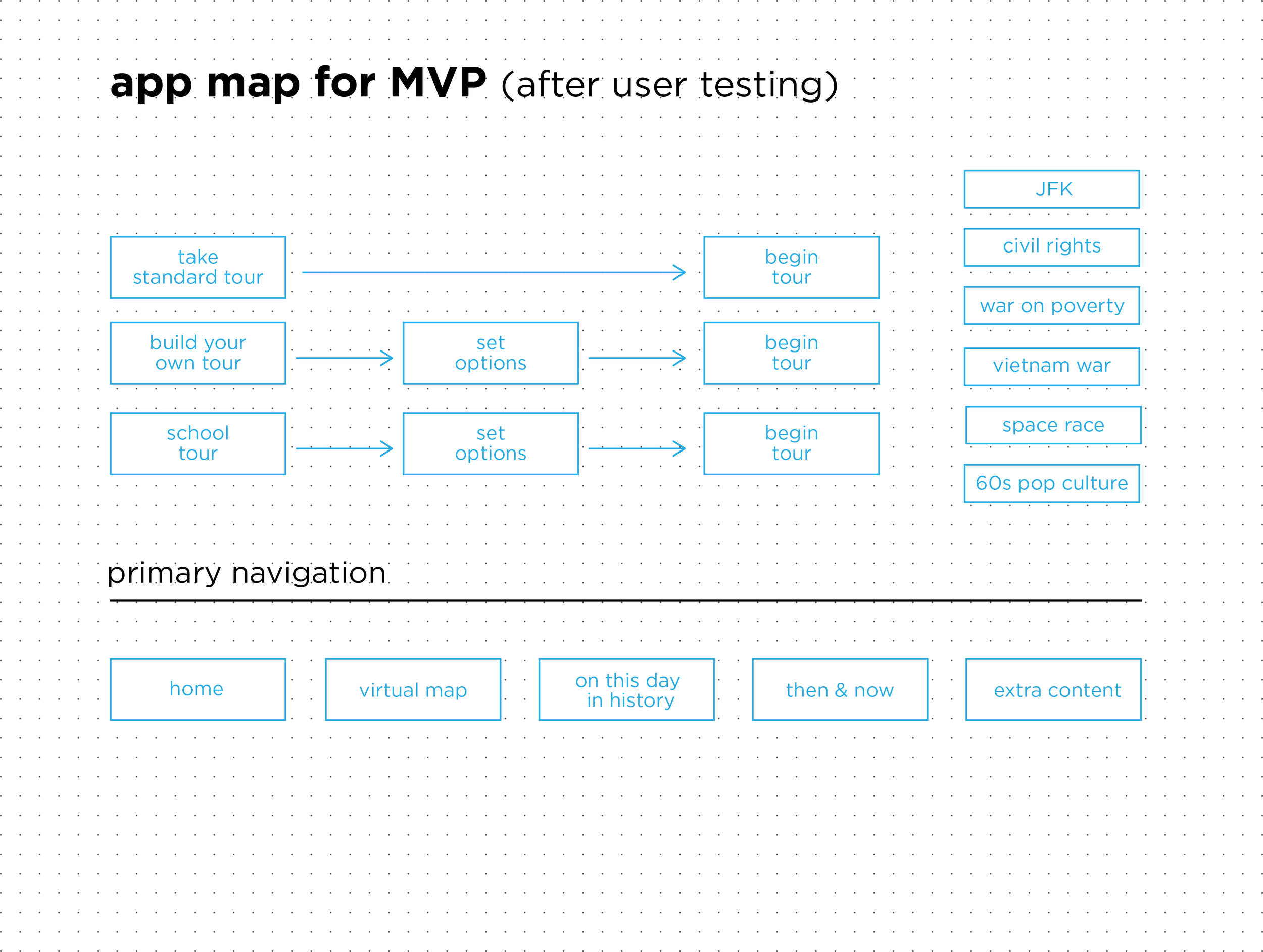
We established a user flow for our app which started with the visitor’s arrival at the library. The user flow allowed us to account for the user at every stage of their visit and we created the app accordingly.
We also created an app map in order to make sense of its layout. This allowed us to order the features appropriately. And of course, we were testing these steps with users to make sure we were creating an intuitive and helpful app.


PAPER PROTOTYPES & USER TESTING
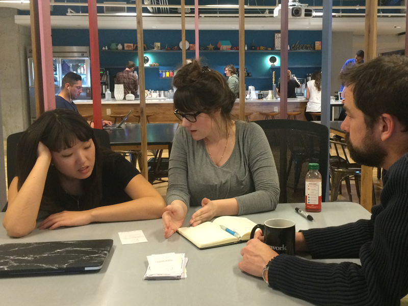
From the user flow, we made paper prototypes of the app. We sketched every possible page of the app on index cards and tested these with users. This phase of the testing revealed a few inconsistencies and sequence issues with our app that we were able to put right before moving on.
For instance, one user wanted audio functionality with the app so we added it and suggested the library sell inexpensive earbuds along with the price of admission. Another user wanted the ability to ignore updates without engaging the social media action so we simply added a CLOSE button on the notification window. We also incorporated a fuller learning experience to compliment the Famous 60s Icons exhibit, a decision made based on user testing.

INTERACTIVE WIREFRAMES & MORE USER TESTING
After adding the functions our users requested, we transferred the paper prototypes to digital wireframes using Sketch. We made these wireframes interactive with InVision. The interactive prototype made further user testing still more fruitful. We introduced the idea of school tours for different age levels and included quizzes and scavenger hunts. We also added the ability to customize the tour to appease the student persona visiting the library to fulfill an assignment who had limited time and interest.
INSIGHTS
CONCLUSION
The final version of our app would present millennial users with a fresh way to experience the news of the 1960s using their own technology and language. The social media experience is familiar and consistent, and it is sure to enhance their experience. And because the technology is affordable and the content is easily updateable, the solution is easily attainable for the client.
The design process allowed me a great opportunity to collaborate with other talented designers, but ones that think and work differently than I do. It was important for us to become familiar with one another’s styles and to find common ground. At every step, we reflected as a group by reviewing what we were observing and what we hoped to create. By playing to everyone’s strengths, we were able to build a solution much more innovative and wide-ranging than anything we might have generated individually.
We also noted the importance of planning ahead. By building the foundation through research and cursory conceptualization, we were more effective and efficient along each subsequent step.
Additionally, we proved the value of failing well. We were open to any and all ideas at an early stage. We quickly tested these, scrapped what was obviously problematic and built on the ideas with promising potential. By doing so, we were able to arrive at a big idea and really run with it once we got there.