Lighthouse | a social media website for political discussion
ROLE
UX Designer & Reseacher
TIME RANGE
Three Weeks
METHODS
Stakeholder Interviews, Competitive/Comparative Analysis, Heuristic Analysis, Customer Journey Mapping, User Flows, Personas, Paper Prototyping, Wireframing, User Testing
TOOLS
Sketch, InVision
THE BRIEF
The founder of an Austin-based startup wanted to grow the user base and activity levels of a website. Lighthouse is a newly launched social media platform that provides users a dedicated forum for discussing and debating politics. A colleague and I implemented research-based design which would lead to improved usability of the site.
Our solution was multi-pronged. We recommended a series of site changes and improvements to take place immediately. Further, we outlined next phase improvements that were dependent upon the client’s time and resources.
*This project was completed for the GA UX Design course, but my partner and I worked closely with the founder of Lighthouse.club.
RESEARCH
STAKEHOLDER INTERVIEW + VALUE PROPOSITION
Step 1: Include the stakeholders - My colleague and I prepared for an interview with the website’s founder by drafting up a list of questions. We noticed issues with the site straight away that would be important to amend, but before getting there we wanted to learn more about the chief stakeholder.
Step 2: Identify the unique value - It was important to know the founder's path to creating Lighthouse and to firmly establish his hopes for it. We wanted to discover the Why before getting to the How and What.
Step 3: Ask the right questions - We were then able to get into the intricacies of the site. From our earliest observation of Lighthouse, we asked more pointed questions about usability— from the sign up process to the nuances of the topic debates. The information gathered from the primary stakeholder interview would be useful going forward, as would the establishment of Lighthouse’s value.
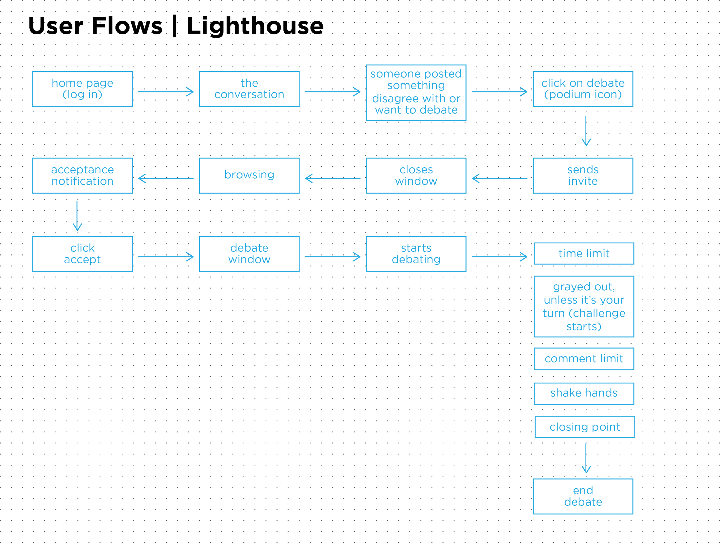
Step 4: Identify inefficiencies - The client requested that we encourage debate participation and observation by improving the experience. In order to increase the efficiency of the debate process, I watched my colleague move from login through debate completion and developed a user flow based on the observation. More generally, we identified what we deemed to be problems with the site by writing them on post-its and grouping them together by category. We then thought of very high level solutions to get the ideas flowing.


COMPETITIVE + COMPARATIVE ANALYSIS & USER TESTING
Step 5: Survey the competitive landscape - We moved to competitive and comparative analysis with a clear view of Lighthouse’s value proposition. We looked at sites specific to political discussion and others that were focused on interactive news feeds and/or a social media experience. Because we knew exactly what the stakeholder had in mind for Lighthouse, we were thinking of ways to position its value against other sites as we analyzed them.
Each step along the way: Test with users - Meanwhile, we were conducting multiple rounds of user testing. For some users, we provided the web address (or asked them to open the app on a smart phone) and gave very little instruction. We wrote down everything they said and did from there in order to evaluate general impressions of the site. For others, we gave specific tasks such as complete the onboard process or challenge a follower to a debate. Thanks to their fresh perceptions sans preconceived opinions, we identified many more usability issues through these early rounds of user testing. We also solicited a survey to current users of Lighthouse and beyond — we received over 100 replies which gave us valuable insight into users' opinions regarding political discussion on the internet.
Step 6: Advocate for the user - From the user interviews and survey results, we developed personas to gain a visual representation of our user base. This would guide decision making throughout the design process. We also developed a customer journey map to understand how a user would come to engage with the site.


FRAMEWORK
CONCEPTUALIZATION & PAPER PROTOTYPING
To begin the design process, my colleague and I individually sketched various pages of the site at an abstract level. Our primary concern was to use the information we gathered from user testing to determine the layout of the site. We timed each sketch and came up with wide-ranging ideas. To whittle them down, we compared our sketches and doubled back to our user testing findings. After determining the information architecture, we moved the sketches to a paper prototype.
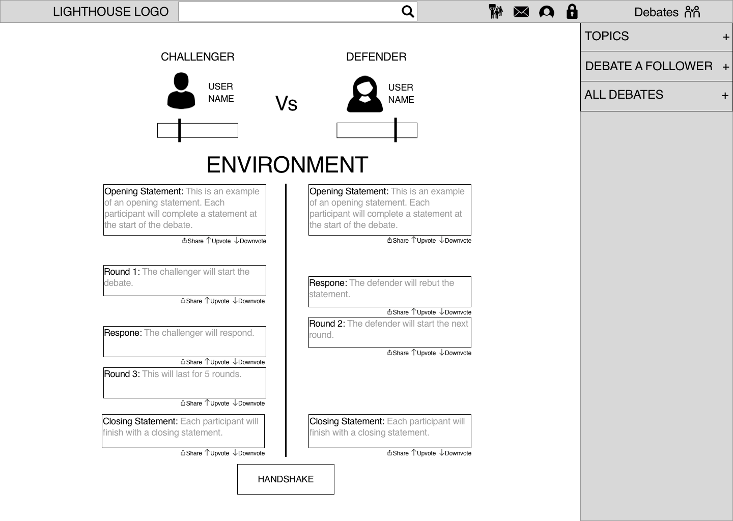
The paper prototype consisted of all the pages accessible from the home page and carried the user through the process of engaging in a debate. We tested the prototype with multiple users in a similar manner to our earlier rounds of testing: some were given tasks to complete while with others we asked what they would expect to follow specific actions. Rather than interacting with an active website, users were tested with the paper prototype. This revealed further inconsistencies and hindrances.
One example of such is the debate invitation process. Our client tasked us with improving the debate experience and as such, we placed a large emphasis on this during testing and through the design process. But we overlooked the seemingly minor gap between challenging an opponent to a debate and receiving a response. Due to this revelation during user testing, we were able to create a solution before creating the digital wireframes. The ability to quickly correct issues is one of the benefits of paper prototypes.


INTERACTIVE WIREFRAMES
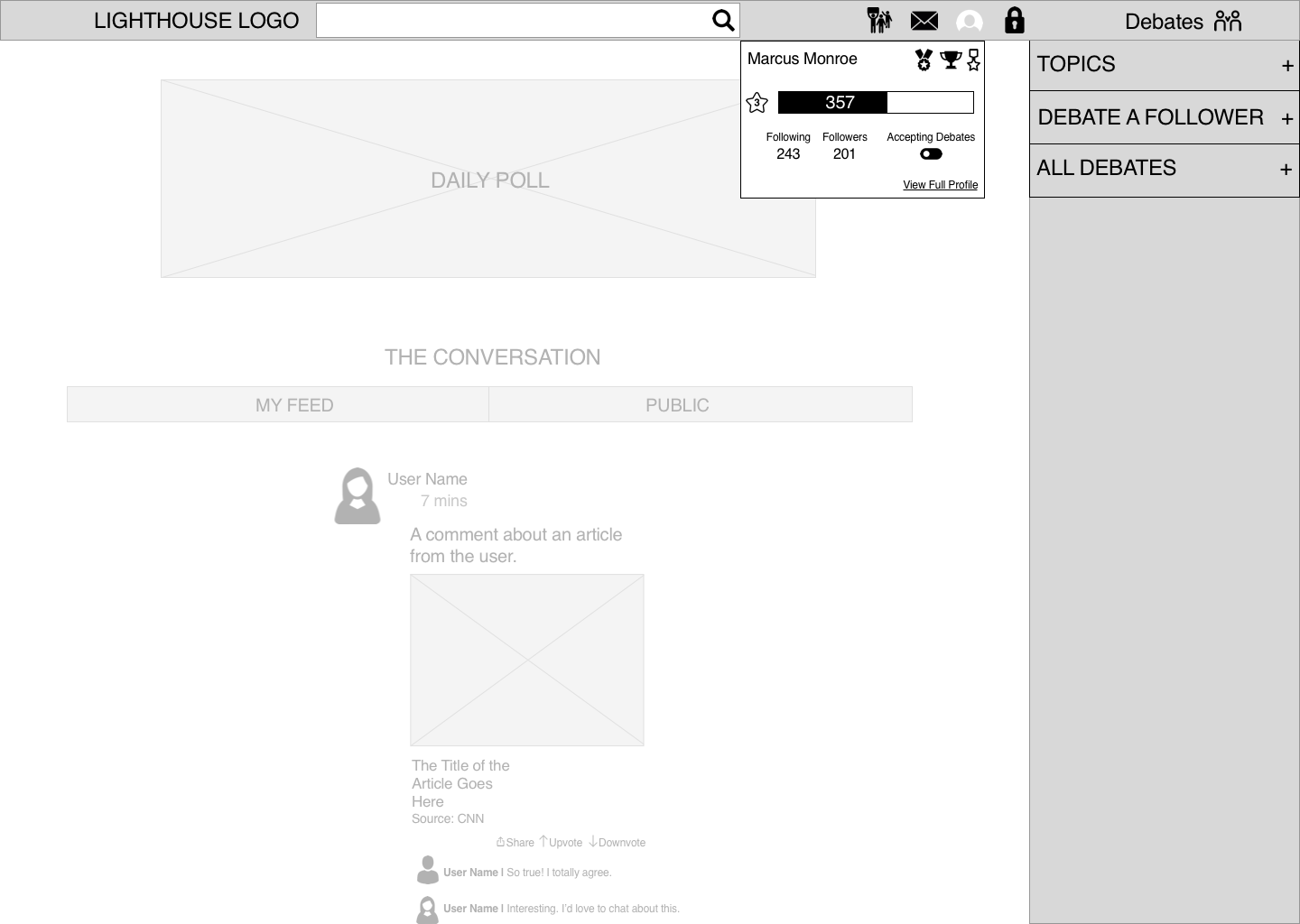
After multiple rounds of user testing and further iteration on the paper prototypes, the wireframes were created digitally using Sketch3 and made interactive with InVision. Finally, more user testing was conducted with the interactive prototype to ensure that the solution was intuitive and efficient for the user.
INSIGHTS
CONCLUSION
Our client was a relatively newly formed startup seeking further investment. As such, it was important to present feasible changes based on the budget.
We determined from the earliest meeting with the client that his hopes for the site revolved around creating a place to discuss politics in a civil manner. The idea for this site was born from the founder’s own experiences participating in and observing political discussion on other social media sites. By creating a site focused primarily on political news and discussion, many of the negative issues surrounding political discussion on social media would be eliminated.
The idea then was not to drastically differ from popular social media sites in style. Rather, the styles should be similar because users were accustomed to it. The difference would be in the content featured on the site.
From a design perspective, we carried over some of the look and feel of other social media sites. This was the primary focus of the first phase of the design. We presented the client with easily implemented ideas that would create subtle but important and effective changes in usability.
This was a key insight: the changes did not have to be drastic or the idea extraordinary in order to be effective, they just had to be based in user research.


